
Simply By Arrangement


Simply by Arrangement
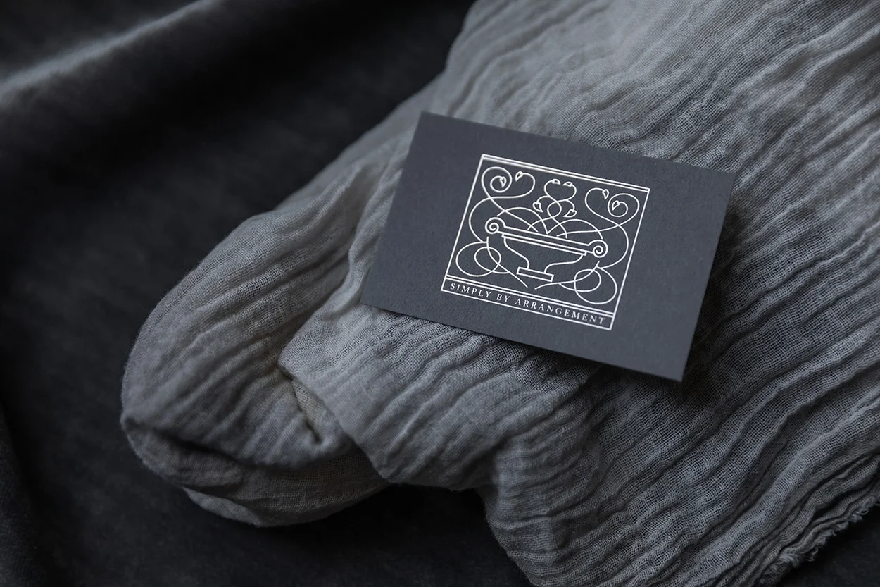
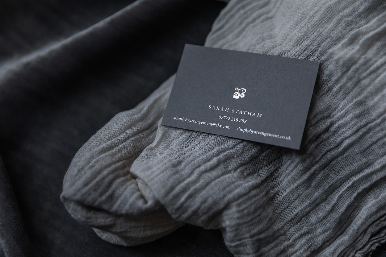
(Brand identity used across notebooks, canvas tote bags, post cards and business stationery)
Simply By Arrangement's mission is to bring beautiful seasonal flowers to the north of England and beyond. Sarah describes herself as ‘Yorkshire’s finest flower fettler’ and her floral designs are full of texture, movement and life – almost as if still growing. This is echoed in the illustrated main logo which represents an abundance of vine leaves and tendrils. Sarah sources and collects vessels to complement the flowers and her most treasured one is featured in the logo to add a personal touch. A second logo features Sarah’s favourite flowering fritillary, a soft and gentle delicate flower reflecting her sympathetic understanding and empathy with nature.
The paper used throughout is uncoated and tactile with a colour palette of neutral grey allowing the natural beauty of the flowers to take centre stage. Traditional foil block printing and the use of a classic English typeface add to the timeless elegance of the design.


